
Magazine Cover and Subscription Cards
Graphic Design
Audience: Dog and Magazine Enthusiasts
Responsibilities: Create a magazine using Photoshop
Tools: Adobe Photoshop and InDesign
Project Overview
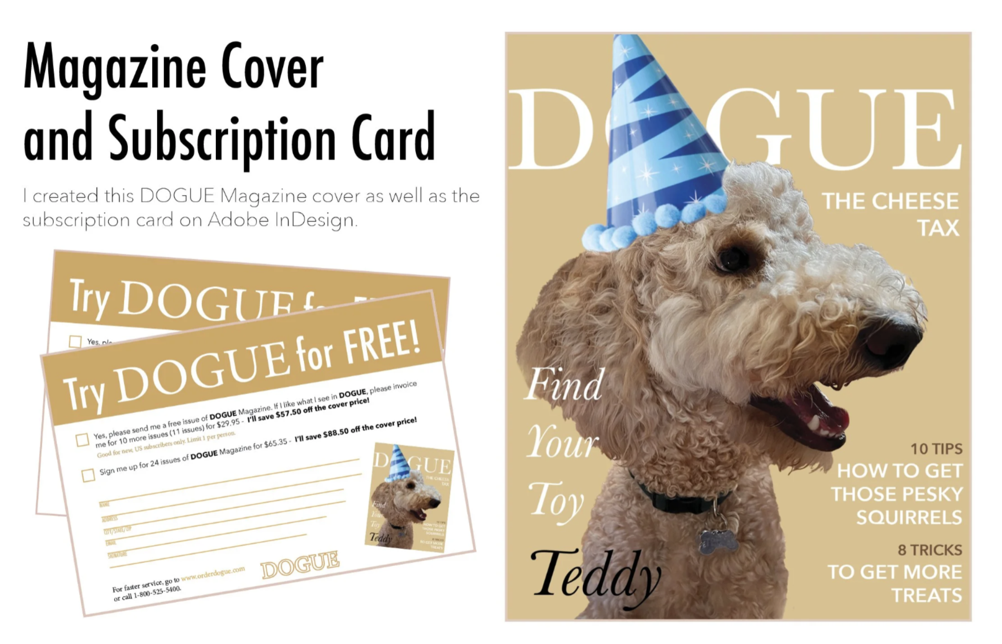
The core visual of the project was the cover model which is my standard poodle, Teddy. I used Photoshop to transform a standard photo into a cohesive editorial image. The first step was a complex subject mask. Using the Select Subject tool, Refine Edge Brush, and precise clipping paths, I meticulously isolated the dog’s intricate curly fur from its original background. This ensured the edges would blend perfectly with any layout color. To match the high-end editorial feel, I applied professional color grading. This involved using Curves and Hue/Saturation adjustment layers to make the warm gold of the coat richer and the highlights pop. I also applied subtle Dodging and Burning to accentuate the muscle structure and snout details, giving the dog more dimension. To add the playful "DOGUE" attitude, I composited the blue striped party hat onto the dog's head. I paid close attention to realistic shadow placement beneath the hat and used a small drop shadow with a soft blend mode to ground it. The tiny "pom-poms" on the collar were also a key detail, added to tie the hat and accessory colors together. The background was replaced with a warm, editorial taupe, and the image was exported at high resolution with an alpha channel, ready for place in InDesign.
Process
As part of a design exercise, I created a cohesive set of print assets for a fictional magazine, "DOGUE," targeting pet enthusiasts with a sense of humor. The project involved two main deliverables: a high-fidelity magazine cover and a companion subscription order card. My goal was to create a polished, visually appealing brand experience by combining advanced photo editing techniques with precise typography and publication layout.
I established a professional visual hierarchy by applying a consistent brand identity across the "DOGUE" cover and subscription card. Using a clean serif masthead and a strategic two-column grid, I balanced playful cover lines with precise typography to ensure legibility and depth. This continuity was extended to the subscription card, where I designed a functional, user-friendly form utilizing custom grids to mimic an authentic publication experience.
Results and Takeaway
The final deliverables is a high-fidelity magazine cover and a subscription card that demonstrates a seamless brand experience. By successfully isolating complex textures like fur in Photoshop and managing intricate typography in InDesign, I created a project that feels both playful and professionally produced. This exercise reinforced the importance of non-destructive editing and taught me how to bridge the gap between creative photo manipulation and technical publication standards, ensuring all assets were print-ready with proper bleeds and presentation.